Font Matters?
 Pretty much all of the Sci-Fi credits/titles that I looked at had black backgrounds, which is common in all movies, but especially in Sci-Fi. As for the fonts, they vary by the style of movie, but they are very different from other genres. For example, horror movies have messy, red font, while Sci-Fi has large, defined, and in most cases, square and uniform lettering. Of course, it depends on the type of movie, as some more futuristic, positively toned movies have more colorful, curved fonts like Tron: Legacy or Star Wars. The more realistic dystopian films like The Terminator and Alien have simple, monochrome, black and white, blocky font that keeps with the nature of realism set in the films. Obviously this doesn't apply to all movies in the genre, but its a good reference to base the title/credits of my movie off of. Some titles incorporate the type of technology that is shown in the film. In the Tron Legacy picture, the light blue color reflects the color used in the film, and the "O" in "Tron" is showing the disc that the characters use as a weapon. The "Iron Man" title is more uniform and realistic, and the words appear as though they are actually made of Iron.
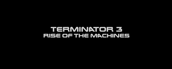
I didn't think this was all that important going into this project, but the size, font, style, of the title/credits in my film, I found out, is crucial to the feeling of the audience about the movie they're watching. It's especially important for a 2 minute film like mine, because it gives the audience an idea of what to think/feel about the movie.
The credits could also be somewhat important, even though I would only have two people to credit, counting myself. Most credits match the font of the title, which I have already gone into detail about. Some credits happen during the opening scene, and some just happen in a sequence before the movie starts. Also, most credits appear normally, but Sci-Fi is known to mix it up, such as the giant yellow crawl of the opening in all of the Star Wars films. I'm not planning to go abstract like this, but it's always a possibility.
Source: https://www.creativebloq.com/inspiration/10-best-sci-fi-fonts


Comments
Post a Comment